



Visual Identity
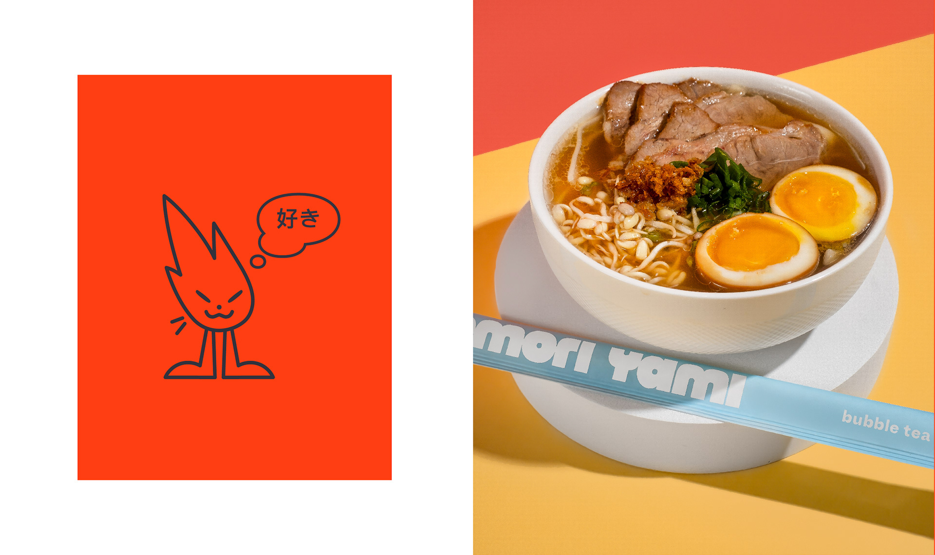
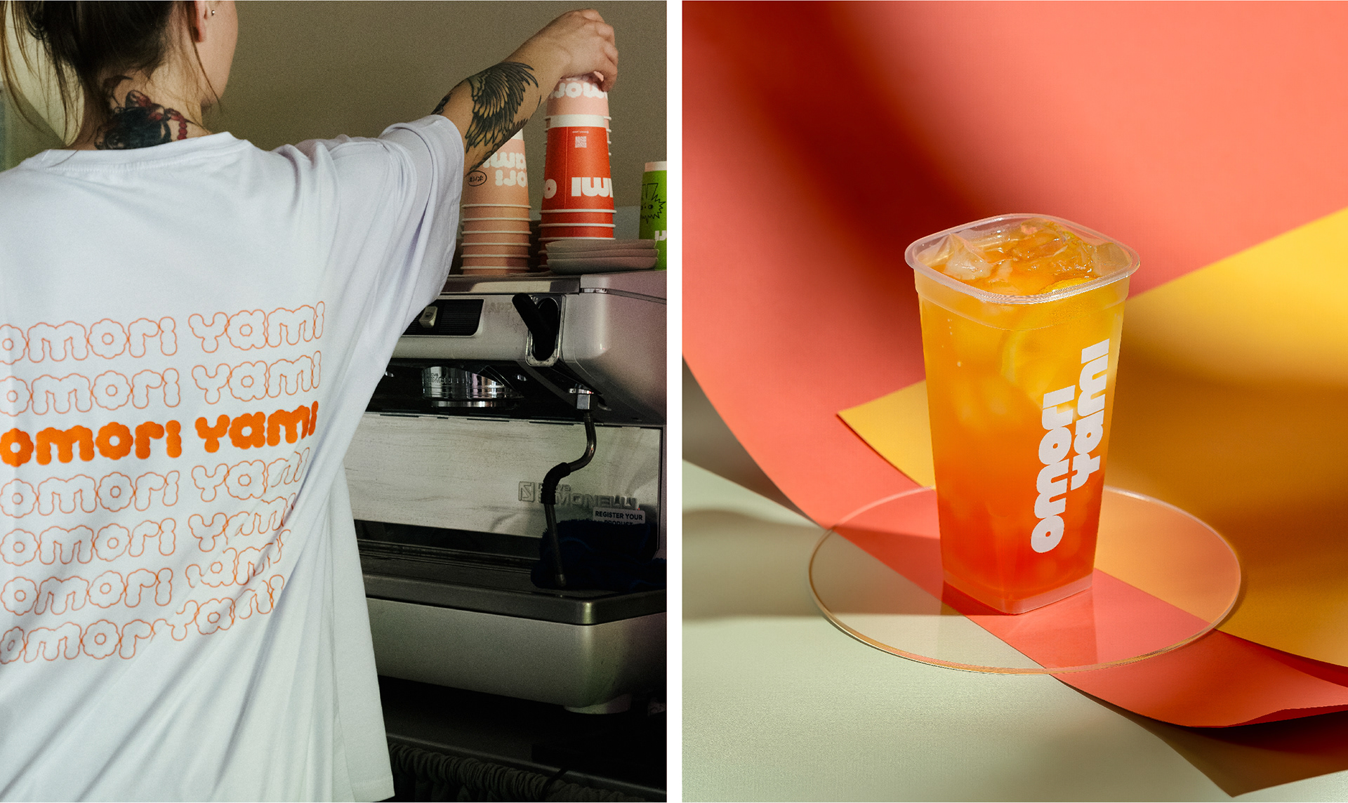
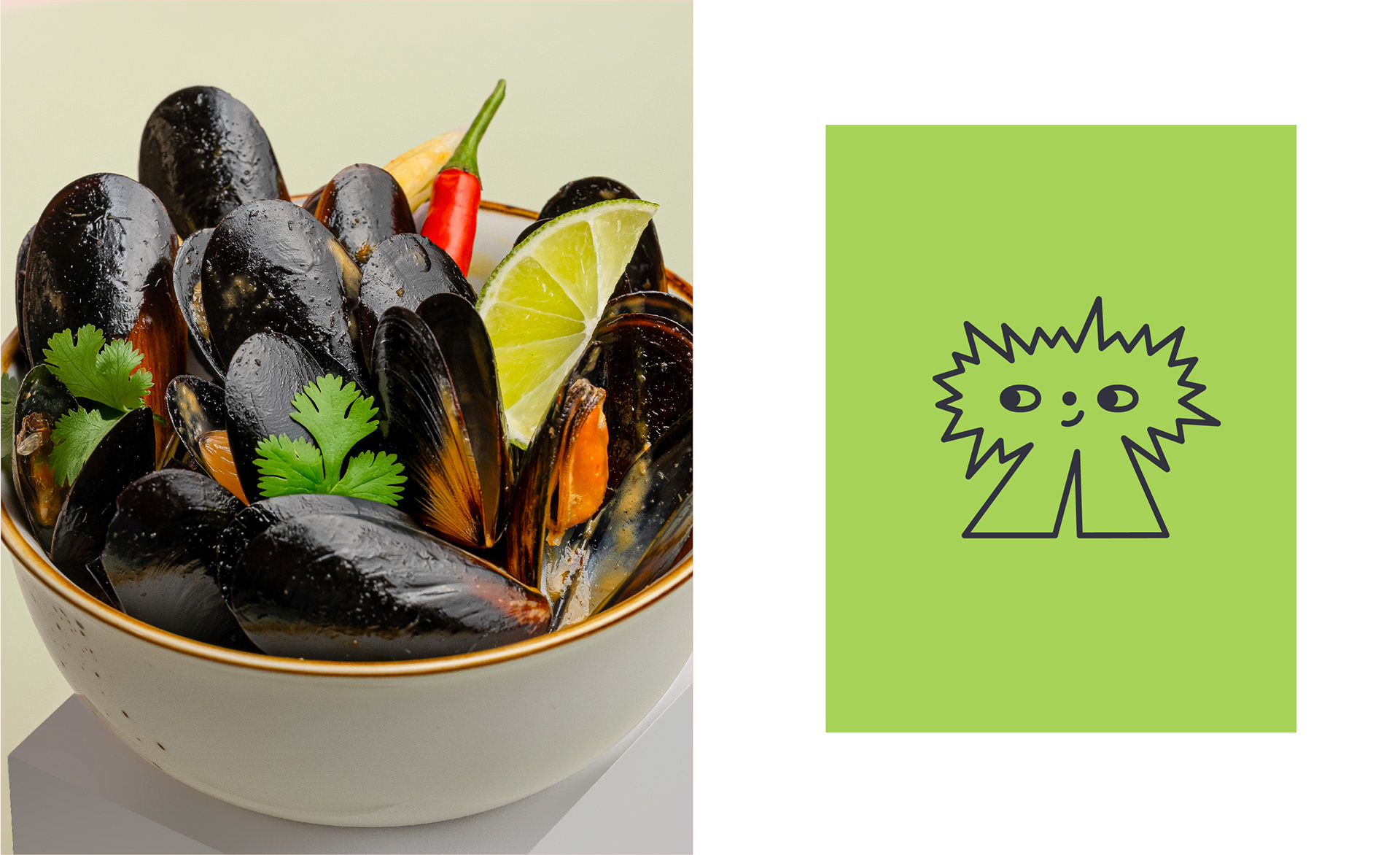
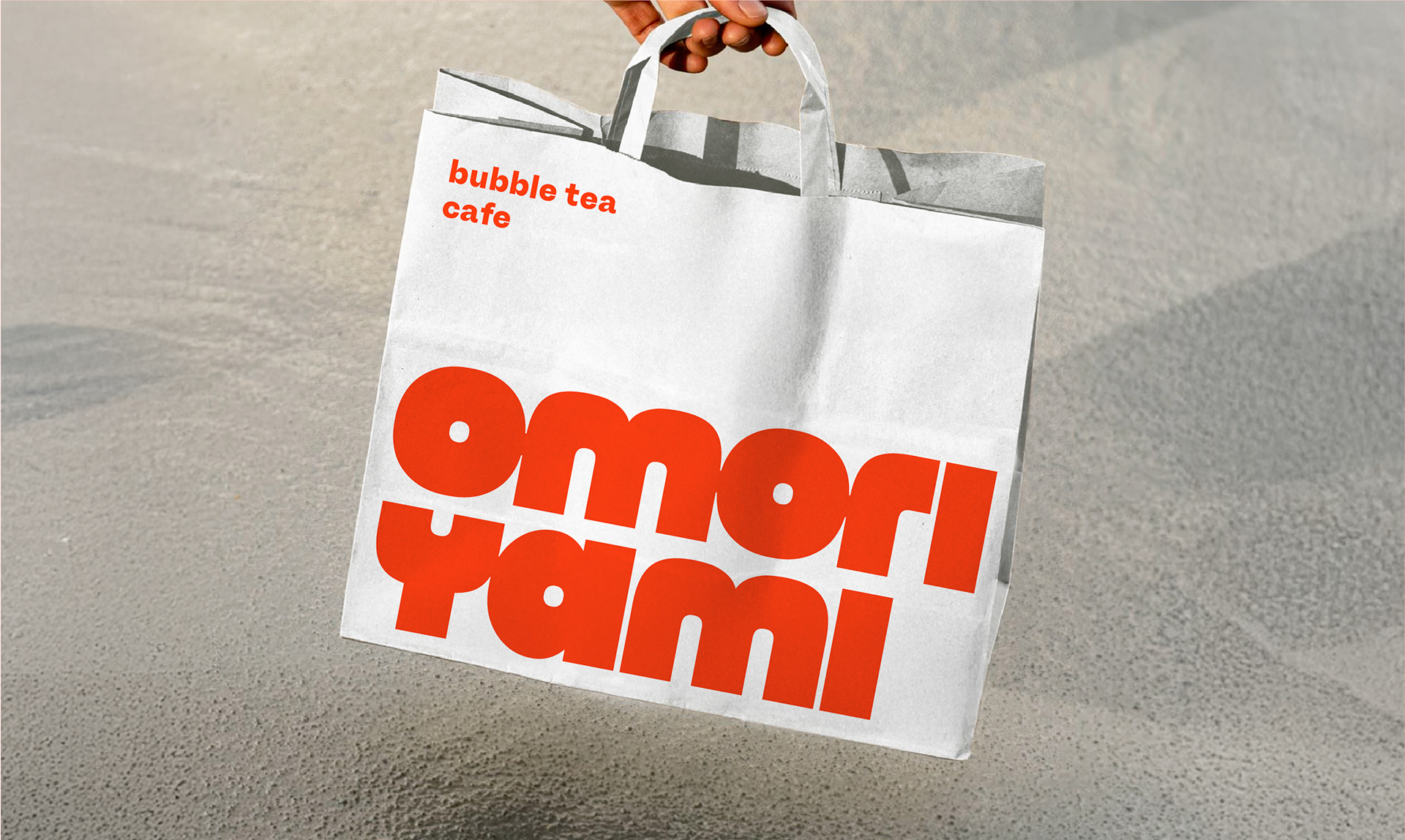
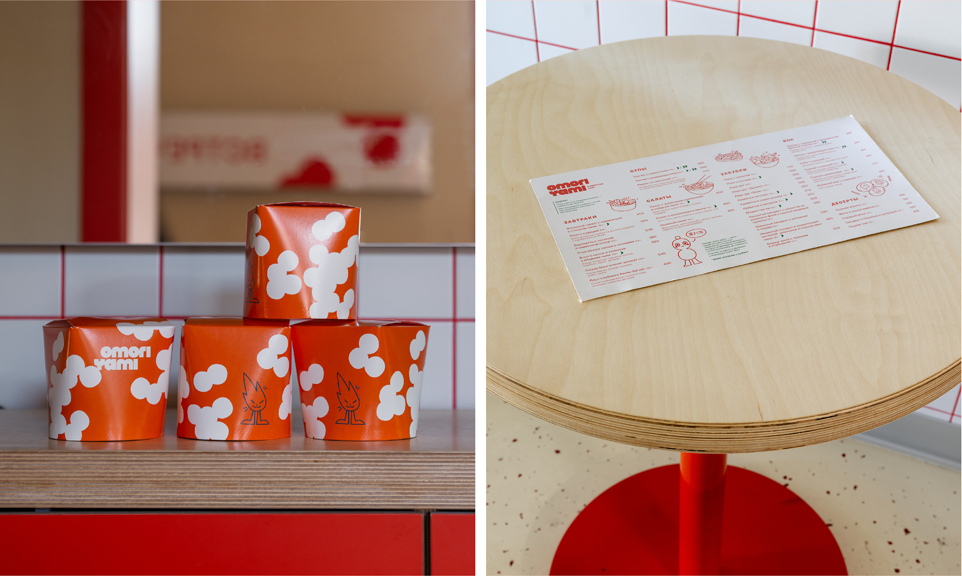
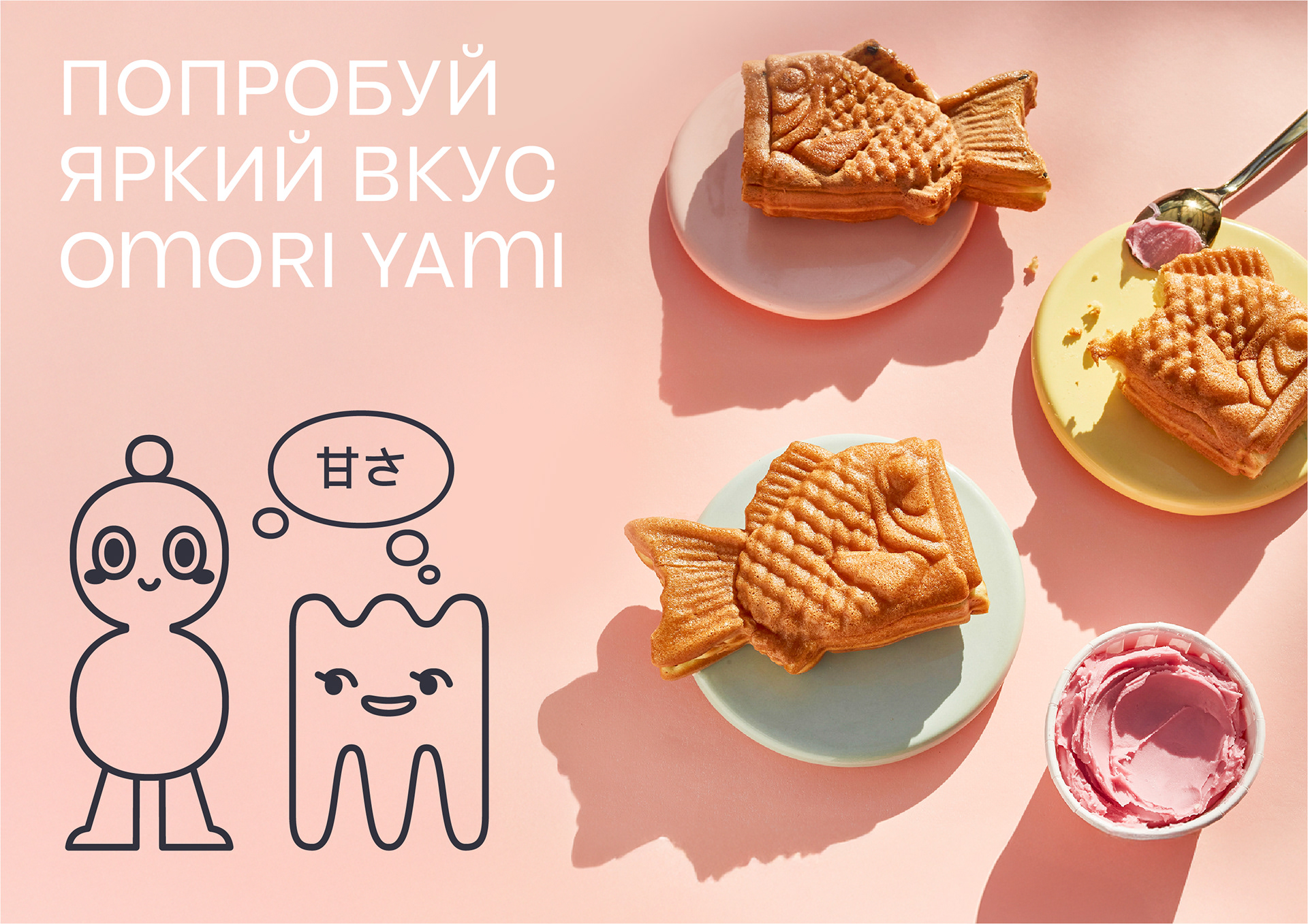
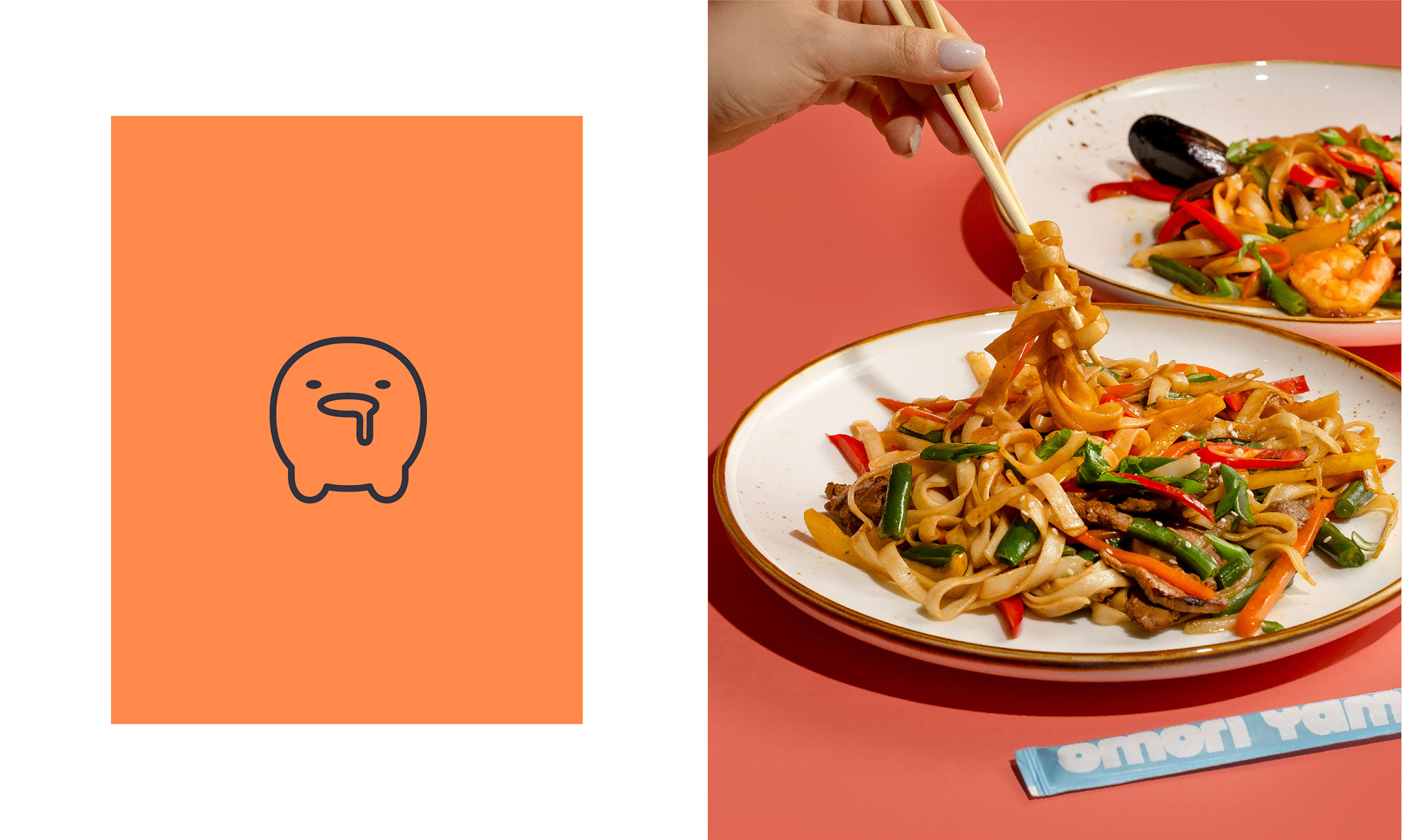
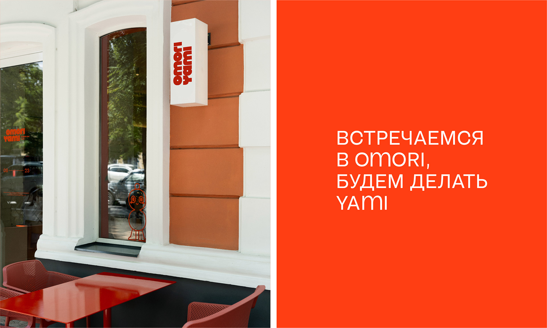
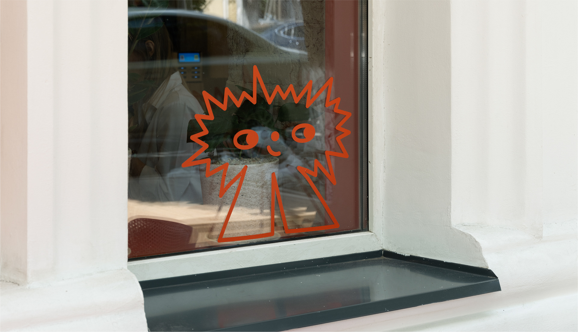
We developed a flexible branding system. At its core are five colorful characters representing the basic tastes (sour, salty, sweet, bitter, umami), who become the main heroes of social media and packaging. Clean lines and bold typography are inspired by the texture of tapioca and the neon lights of Asian megacities. The key element is a mascot that gives the brand a friendly feel.
We developed a flexible branding system. At its core are five colorful characters representing the basic tastes (sour, salty, sweet, bitter, umami), who become the main heroes of social media and packaging. Clean lines and bold typography are inspired by the texture of tapioca and the neon lights of Asian megacities. The key element is a mascot that gives the brand a friendly feel.
Product as Content
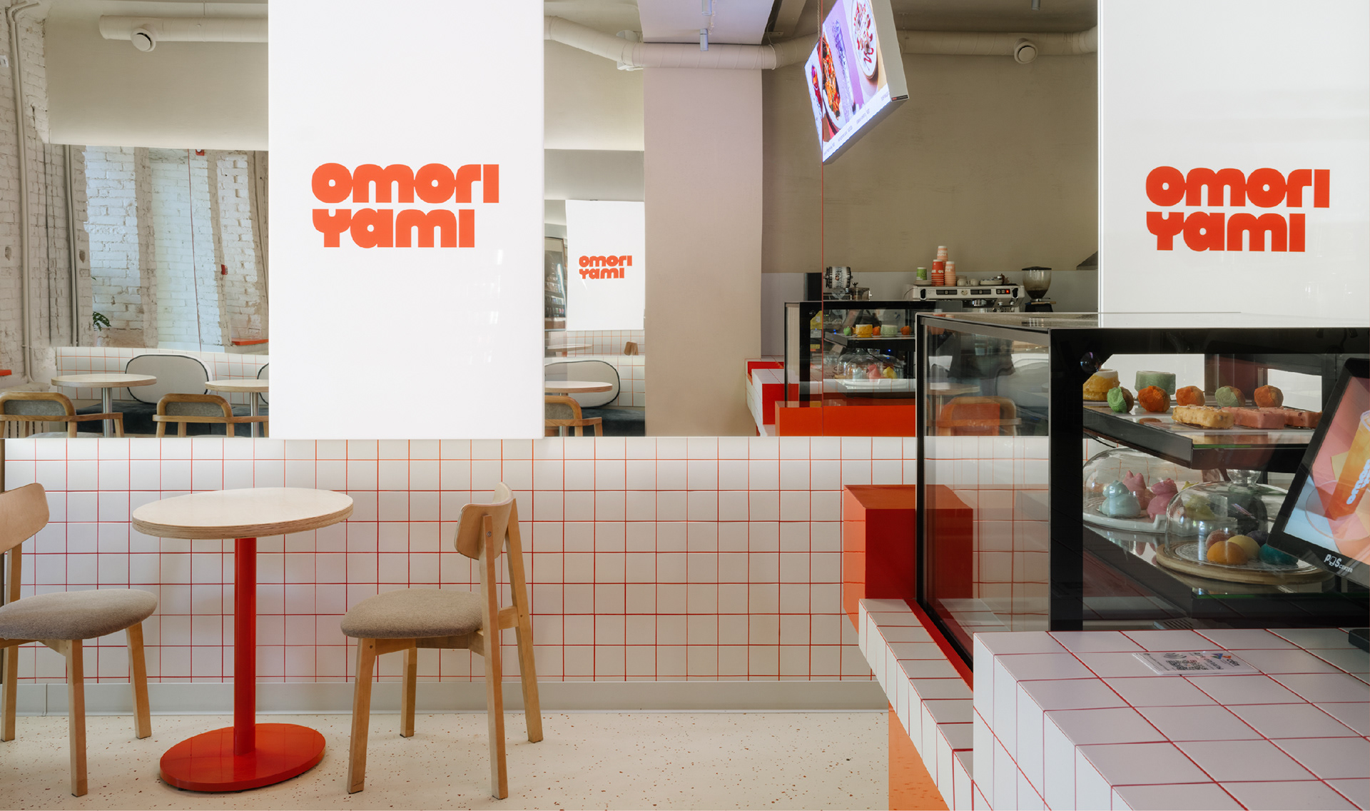
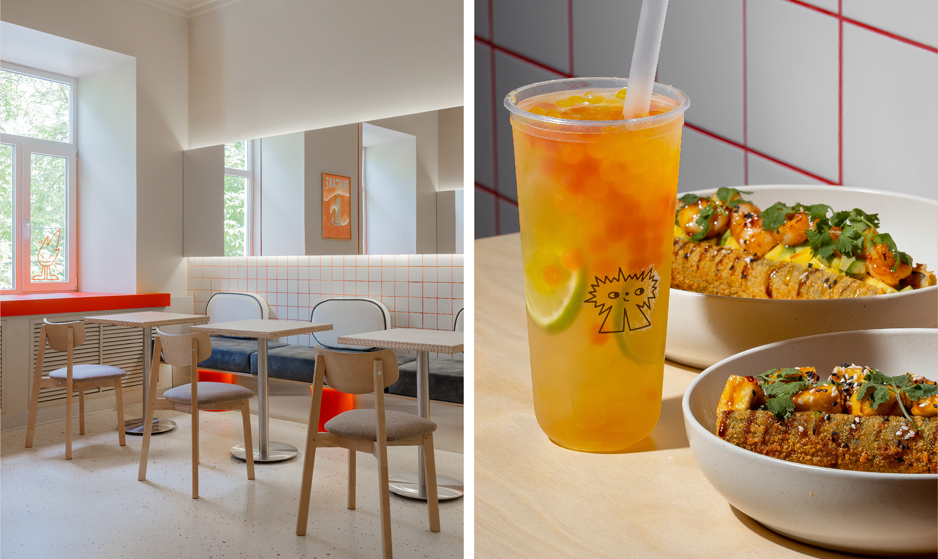
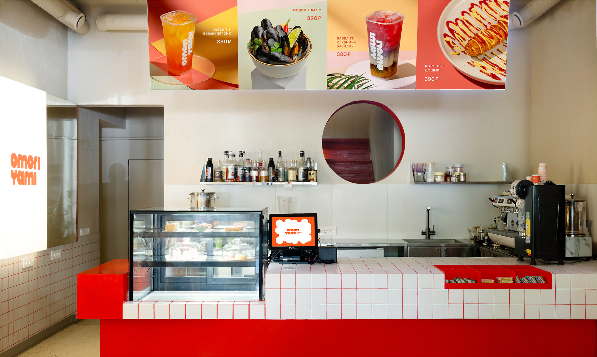
We designed the menu and the space as ready-made photo zones. The key products are "Instagrammable" tapioca drinks, lemonades, and desserts (mochi, fish-shaped waffles). The interior supports this aesthetic: an open dessert display at the bar, self-service drink fridges, and screens with a dynamic menu.
We designed the menu and the space as ready-made photo zones. The key products are "Instagrammable" tapioca drinks, lemonades, and desserts (mochi, fish-shaped waffles). The interior supports this aesthetic: an open dessert display at the bar, self-service drink fridges, and screens with a dynamic menu.
Creative team:
Art Director: Julia Vyalkina, Irina Kojuharova
Designer: Anna Tokareva, Alisa Streltsova
Client & Producer: Oleg Mironov
Art Director: Julia Vyalkina, Irina Kojuharova
Designer: Anna Tokareva, Alisa Streltsova
Client & Producer: Oleg Mironov